Top Stories View all
Virginia Tech plans annual remembrance of 32 Hokies who died in 2007 mass shooting
Virginia Tech will honor the students and faculty members who lost their lives on April 16, 2007, with a Day of Remembrance and run.
Why Tim Sands is stepping down at Virginia Tech: It’s not politics, it’s football
Something is going on down at Virginia Tech, where the school’s president, Tim Sands, announced to Hokie Nation on Thursday, in a shock move, that he will be stepping down in the coming months.
The Latest
News View all
Free oral cancer screenings available at Augusta County clinic on April 15
Blue Ridge Oral and Maxillofacial Surgery is offering free oral cancer screenings on Wednesday, April 15, from 2-3:30 pm at the Fishersville clinic.
Garden Club of Virginia celebrates blue false indigo during Native Plant Month
The long, cold winter is behind us in Virginia, and the Garden Club of Virginia is celebrating blue false indigo as its most valuable plant.
ICYMI
Sports View all
Richmond announces Alisa Kresge as new women’s basketball coach
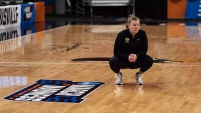
The University of Richmond moved quickly to fill its vacancy in the women’s basketball program, announcing the hire of Alisa Kresge, who led Vermont to three NCAA Tournament appearances in the last four years, as the new head coach.
UVA Baseball: #13 ‘Hoos fall to Notre Dame, 5-3, evening weekend series
Notre Dame starter Jack Radel, solid all season, owned #13 Virginia on Saturday, shutting out the ’Hoos through six, in a 5-3 Irish win on Saturday.
ICYMI
Partner News View all
How do I organize my tax return folder?
Organizing your tax return folder is a difficult task, especially when you have a lot of paperwork and documents from various sources.
From hype to ROI: Why an AI proof of concept is your critical first step
Many businesses treat artificial intelligence like a magic wand, but the engine only works if the gears are precisely tuned to the workload.


